My site will be aimed at people looking to start a new craft and looking for guidance on the subject of resin. Furthermore, the site may serve as an inspiration guide for those who are not necessarily new to the craft, but looking for ideas for new projects.
During the research for my Business and Cultural Context Crit, I discovered that the majority of crafters are women aged between 35-44, although this age range is gradually decreasing. I therefore believe the main target audience for my website to be older millennial women looking to find new creative pursuits. However, the website will aim to be as inclusive as possible, and should still be equally functional to anyone interested in learning more about resin-craft.
User persona: what kind of person are you planning this site for?
When embarking on my research for the User Experience Design module, I decided to reach out to resin crafters directly in order to build more of an understanding of who they were. For this I opted to conduct a Q&A on the Resin subreddit, where I asked the group what drew them to the craft, as well as what might frustrate them about the medium. However, I noticed that the community was not particularly active, with an average of 0-3 replies on each post. I was therefore not sure if I would receive many replies. However, in a 24-hour period I received over 15 replies to my initial question. Some of these answers were deeply personal when giving their reasons for starting to make resin, and the reasons differed greatly. I noted that recurring reasons included:
a need for a creative outlet
dealing with grief
alleviating stress
Furthermore, many of the replies seem to reflect my projected demographic; for example, many appeared to come from women. The pain points they listed for resin-craft include:
safety risks
price of materials
identifying the best tools for use
mess/space
As Youtube was cited as a common resource in my Reddit Q&A, I decided to pursue further research both in order to flesh out my user profiles further and also help refine what my content should include. I gathered user comments from resin-craft Youtube tutorials, being sure to include videos aimed at both complete beginners and more advanced crafters. The comments mainly consist of feedback on the video content, as well as troubleshooting issues with users’ own projects. From their feedback, it became clear that users:
preferred content that was to the point with no ‘babble’
wanted clear information on where to source crafting materials
preferred voice direction over distracting background music
wanted clear, step-by-step instructions
It was at this point I felt I could create user personas based on the Redditors I had interacted with. These user profiles are amalgamations of the responses I received from the Reddit community, with similar circumstances and motivations. They also share the same pain points as both the Reddit and Youtube communities. Furthermore, just as the Reddit community does, these user personas use a variety of influences in locating information on resin-craft, such as social media, online search engines, or directly from peers. They can be summarised as below:
Group A/Beth: A 28-year-old busy professional looking for a creative outlet. Pain points include time-consumption and difficulty level
Group B/Caroline: A recently bereaved 36-year-old looking for inspiration for crafting time with her partner. Pain points include cost and locating of materials
Group C/Sam: a 41-year-old stay-at-home mother eager to start a craft business from home. Pain points include time consumption, level of focus required
Group D/Deborah: a 48-year-old gardener recovering from illness who would like to make use of leftover flowers. Pain points include concerns about safety, clarity of instruction
User journeys: how will your site fit into real life scenarios?
At this point it is worth considering how my users would be most likely to access my site. More than one Reddit response stated that they looked for tutorials on Youtube when they started learning the craft. It would therefore make sense to create a Youtube channel for users to browse as a first point of call that would then link to my site for additional information and resources. The type of device used to access the site is also worth considering. For example, one of my personas is looking to start a business while juggling duties at home. They may not have time to sit down at a desktop computer to do their research, and therefore might choose to access the site via mobile or tablet.
Depending on each user, the user journey might look a little different. When plotting out user journeys, I bore my user personas, as well as their influences, user stories, and job stories in mind:
Group A/Beth: views resin-craft content on Instagram → follows tutorials on Youtube → navigates to my website from there → checks the length of the tutorials in the tutorial section to see if they are long
Group B/Caroline: views my tutorials on Youtube → active on Reddit community → locates site and navigates to the tutorials to see if materials are listed/easily sourced and affordable, as well as if there are plenty of creative ideas
Group C/Sam: has been trying to follow online courses online but finds they require a lot of time and deep focus → searches for alternatives → finds my site and navigates to tutorials to see if instructions are clear/have audio directions
Group D/Deborah: hears about resin-craft through friends → watches some Youtube tutorials → searches online for more information → finds my site and navigates to safety section for guidance
Content strategy: what kind of content will support the site’s mission and benefit its users?
From the above scenarios, it is clear that due to my users’ concerns over time-constraints, budget, difficulty levels, safety, and need for inspiration, my site must include:
video tutorials with audio for those who might become distracted
concise videos with no ‘filler’ content/’babbling’
clear instructions
a section on safety that is easy to find
clear information on where materials can be sourced
cost of materials for budgeters
The information architecture must also be simple and easy to navigate. It would be beneficial to use a stripped-back, minimal approach to the design to help facilitate this, with tutorials, setup tips and safety precautions all easily accessible from the home screen. Including quick links in the footer may also be beneficial to prevent unnecessary scrolling.
As progress on my website continues to evolve, it would be in my interests to refer back to this Commodity Crit to ensure I am fulfilling the user’s needs, as well as solving their problems.
When deciding on a topic for my Major Project website, I was encouraged to choose a theme that aligned with my interests. This is why I chose to make a website based around resin craft; it is an engrossing, creative subject that is relatively easy to fit around my studies. However, while my own involvement in the craft is a fine starting point, it should by all means not be the end point in terms of how I approach the website’s content and functionality.
As the user experience consulting firm Neil Nelson Group points out, it is important to remember that “you are not the user,” no matter how involved with the product’s subject matter the designer might be. To assume that my users share my beliefs and behaviour simply because I also make resin would create a false-consensus effect that overestimates the similarity between would-be users and myself. Just as harmful would be any ideas on my part that only those vastly different to myself would make decisions different to my own. Ultimately, one cannot solve user problems without getting to know the user first.
It is integral, then, to implement a user-centred approach to the planning of my website. This should focus on the user through all stages of development, from planning to the end product. The user should be involved in each stage of the design process where possible to inform any decisions I make.
When deciding on an approach to user research and implementing UX principles, it is important to note that there is no ‘standard’ set of steps to follow, as many organisations have slightly different steps and methodologies when working with users. However, they share essential components, such as user research, problem definition, and an iterative process where it might be necessary to retrace steps if ideas transpire to be flawed, or most importantly, if a user problem is not solved. My steps, adapted from the UX Design Institute, recent workshops taken with user-centred designers Chris How and Steph Troeth, and Adobe’s educational materials on the subject, may serve as a guiding process and are broken down as follows:
The User-Centered Design Process
Product Definition
In order to define what a product might consist of, designers must first scope the lay of the land in terms of their chosen subject. When building any product, it is important to understand what Adobe refers to as “its context for existence.” I would also add to this that designers must justify the product’s existence in the first place. My own justification for a website on resin craft was largely borne from my research for my Major Project’s Business and Cultural Context Crit Session, where I established a correlation between crafts and mental health benefits. As I had also discovered that many UK citizens do not feel they have much free time, I decided to focus on resin craft due to its relative time-efficiency.
Before doing any initial brainstorming of my own, my first approach to roughly defining my website was to look at the existing market. Researching cognate sites helped me identify potential problems that users might face early on. For example, tutorials were often time-consuming, which would not be helpful to busy users.
During this product definition research stage, it is also possible to gain a rough idea of the demographics of potential users. In the case of crafting statistics, I learned that the most likely target audience would be women aged 35-44, although this age range is decreasing over time.
The few existing resin craft websites are often vendors of materials, and their tutorials’ links to product pages mean that there is a monetary motive behind their existence. Tutorials and courses are often long and overly technical, which may put off some new to the craft suffering from time constraints, or simply looking for a new hobby or therapeutic outlet. Youtube tutorials are often meandering with unclear instructions. As such, I decided my initial product definition would be a website that:
is concise and informative
is primarily aimed at women
is not looking to ‘sell’ anything
At this stage, I was aware that the context and justification for the website might change as my research develops, and that the early product definition was just a starting guideline.
2. Research
In her User Research Fundamentals workshop, Troeth stressed the importance of thinking about real people. However, as resin is a fairly obscure craft, I did not think it would be beneficial to conduct in-person research with my immediate peer groups. I decided that the best way to progress with my research would be to look at online communities that share an interest in resin craft.
After roughly defining my website, I set out some research objectives in order to gain a sense of how my website could add value and solve the user’s problems. I did this by drafting some ‘W’ questions:
Why did the user start working with resin?
What does the user find frustrating about the medium?
How does the user respond to resin-related content online?
In her presentation, Troeth also discusses the craft of questions, and emphasised Erika Hall’s assertion that the designer must know what decisions questions will inform before they are asked. I knew that the questions I asked would influence my website’s content, as well as help me understand the user further. I chose to post on a Reddit forum that focused on resin craft, asking the community why they started working with resin, and what put them off learning. Through identifying myself as a novice crafter, I could identify my own frustrations as a means of encouraging the community to share their own stories.
Asking user communities ‘W’ questions
To gain additional insight into users’ needs and problems, I gathered user comments from several resin tutorials on Youtube. For this task I made sure to select from a mix of content aimed at beginners and more experienced crafters to see if there would be any commonalities, as I do not want my website to exclude potential users based on experience level.
As I progress in my research I may choose to conduct individual interviews online with participants from the Reddit community. These would consist of open-ended questions (why? when? how?) to find out more about their behaviour and needs. As some of the responses I received to my initial Reddit post were sensitive and quite personal in nature, I would take interview ethics into consideration and remind participants that they can stop the interview at any time.
3. Analysis
My research enabled me to begin the process of moving from “what” users say to thinking more deeply about “why” they say it. Through the detailed responses I received in the r/resin community, I learned what inspired people to take up the craft, as well as what their pain points were from the Youtube tutorials. As a lot of the responses were quite in depth and revealed a lot about the participants’ characters and motivations, I was able to begin the process of visualising my findings. My next task was to therefore create user personas that will serve as realistic representations of my target audience for reference. I was able to create four user groups, each with different circumstances, goals, and frustrations.
Example of a potential user persona
From the user profiles I was able to construct an empathy map to build a fuller understanding of my potential audience. By examining their feelings, overall goals, influences, and pains, I can begin the process of defining the problem to solve.
User stories are also a valuable tool for establishing why users want to achieve certain goals. They may take the form of a simple persona → need → purpose sentence as follows:
As a { user role / persona }
I need to { do what I need to do }
in order to { accomplish goal }
Essentially, user stories can help designers boil down their users’ motives to a ‘truth’ that must always be taken into account when designing. Another effective empathy technique is to create job stories, where the designer steps into the user’s shoes to provide additional context to their situation:
When {situation}
I want to {motivation}
so that I can {expected outcome}
From here, it is possible to begin defining the problem that needs to be solved. I can look at the various issues the user groups might face and determine how best to tackle them.
4. Synthesis & Design
Having analysed my findings and drawn conclusions from it, I will next need to begin the process of synthesising it into the design and content of my website. There are many ideation techniques, but one particularly effective starting method proposed by Chris How is to brainstorm ‘The Worst Idea Possible.’ For example, if my Group A user’s pain point is that online tutorials are often overly-complicated and inaccessible for beginners, then I might propose a long series of video tutorials with ridiculously difficult quizzes at the end of each module. By pointing out what would not work, I can then begin to form ideas for what the user actually needs.
It is at this stage that I would form a list of “How might we…” questions based on the user pain points. For the above pain point, for example, my question might be phrased as:
“How might we make sure tutorials on the website are clear and easy for busy people to follow?”
Having decided which content should be included, I would then create possible UI Flow sketches to begin visualising the information architecture and user journey. While doing this, I will consult pattern libraries to see if there are any potential UI problems I can address before I begin wireframing and prototyping with Figma. For example, some of my users suffer from time constraints, and as such they should be able to find the content they need quickly and effortlessly. It is at this point I will begin to narrow down what Andy Clarke refers to as “design atmosphere” concepts, and create style tiles and element collages that offer glimpses of my planned colour, type, and other interface elements.
It is crucial to develop a timeline for my content creation as soon as possible. Establishing the right tone for it early on will therefore be beneficial. I noted that the warm, welcoming tone of the Reddit community was very useful to myself as a beginner of resin craft who might otherwise feel daunted; I plan to use a similar tone in my own content. In the interest of connecting with users and presenting a human, genuine tone, I therefore plan to only use images and content created by myself as opposed to stock images, as well as meaningful copy that users can relate to.
5. Validation
Once the prototyping stage has begun, I will begin testing the usability of an early version of the website. Early on, I will use the ‘eat your own dog food’ UX concept by navigating the site on a range of devices to help build empathy for users, who will most likely view the site in a variety of ways. I will then ask course peers to participate in usability studies to collect both quantitive and qualitative data, being sure to define goals through questions such as:
Is the content easy to understand?
Can the user complete a given task effectively?
Users will be given tasks to perform, such as “Find a jewellery tutorial” or “Look up safety guidelines.” Participants will not be given clues on how to do these. Ideally this would take place in a moderated setting and be in-person, as further cues such as body language and mood can be picked up on. Users will be asked to provide qualitative feedback through an open-ended question interview after the test.
I will also create a survey for members of the Reddit community to complete once they have been given the chance to view the site prototype. Questions will be close-ended in order to obtain quantitive user opinions on specific website features. This remote testing has the added advantage of allowing users to interact with the website in their own environments; the context in which the website is intended to be used. I also plan to explore analytics tools to gain further insight into how users interact with the site.
Conclusion
As my research continues to progress and prototyping begins, it is essential to remember that all design ideas are little more than assumptions until they are tested with real people. Whether these people are seasoned resin creators or new to the craft, I should listen to any feedback given and use it to strengthen my website’s design. Once this design is completed and it is time to pitch it, it is my job to find the story of the work by expressing what the problem is, and exactly how my website solves it.
This design studio uses black backgrounds with a muted peach shade for its text. This understated look contrasts the brightly coloured animated shapes that gently float across the screen.
These moving shapes recur throughout the website. Their neon shades and random shaping are for the most part not recognisable as any familiar objects. This very much gives the impression that we are looking at a work of design, where thought has been put into every shape, quite possibly beyond the scope of the viewer’s understanding. All we know is that we are looking at the work of designers, with meaning that might elude us due to their seeming complexity.
For call to action sections, such as the contact page, bright colours are taken away and replaced with a more conventional photo of a team member.
This wine producer eschews the understated look of most product pages, and instead is an explosion of layered colours and images.
A warm shade of yellow is reminiscent of sunlight and hazy weather, while the verdant greens remind the user that nature is a central theme of the business.
Black and white Python-esque imagery contrasts with the warm shades of the backgrounds, as well as the tropical, exotic imagery.
When buying online, shoppers have become accustomed to minimalist layouts, few colours, and linear product listings. With highly stylised fonts, as well as slightly psychedelic warm tones and patterns, this site by all means should not ‘work’. Yet it does.
Ree Drummond’s carefully crafted image as a country gal is reflected in her site’s choice of colours. The slightly twee pinks, reds, and blues of the flowers in the header are reminiscent of a country living room, as is the muted green that resembles slightly faded wallpaper.
The background textured yellow would also not look out of place in a Southern drawing room (or kitchen, given that this is predominantly a recipe site). Yellow, as well as being a bright, friendly colour, is often used in fast food logos. According to Stellen Design, yellow is a colour often intended to evoke hunger, as is red. The Pioneer Woman site uses this yellow throughout, as well as the red lettering of the logo and nav links.
In the fashion section, we see a light teal shade that contrasts with red and light coloured flowers, again reminiscent of wallpaper. The colours in this context are feminine and cheery, and while blue is often labelled a cold colour, here it is warm and inviting.
This Massachusetts hotel uses two main fonts throughout. Its header, subheadings and nav links are a bold sans-serif that immediately draws the eye. Note that its call to action (‘Book Now’) is the only colouring.
The heading font is warm, with somewhat rounded edges and a use of caps that seem reminiscent of the Tintin book series. This gives a sense of adventure, and with its almost khaki background colour, seems to harken to a time of colonial exploration, safaris, and travels of yesteryear.
The site chooses to use a monospace font for its secondary typeface. This is a somewhat bold move, as its fine, small lettering threatens to be easily ignored. However, it serves to contrast with the bold headers, and is not eclipsed by them. It seems like text suited to a mission brief, hastily typed out on a typewriter. This works well with the site’s vintage aesthetic, and a sense of adventure in unknown lands.
The New Yorker (Desktop view)
Established in 1925, The New Yorker has not strayed far from its origins in terms of type. It uses characteristic headers with extremely wide counters, giving a rounded appearance to the characters. Serifs are ornate but understated. Overall, there is an art deco, Roaring Twenties feel to the headings.
When an article is opened, there is a lot of whitespace surrounding the headline. This makes it very clear to the reader which article they are currently reading.
The New Yorker makes the decision to use all uppercase on its headlines, dates, and its logo. While this may create difficulty for some readers due to all of the characters appearing on the same level, the use of white space around these areas helps to prevent cluttering and confusion.
A much more ‘web-friendly’ bold sans-serif is used for the author’s name and date, while the byline is in italics. The different weights and styling help the reader to distinguish these pieces of information from each other.
Interestingly, The New Yorker chooses to use serifs for its article text, as well as drop caps for its opening line. In this way, the text closely mimics that of a printed article. Line height also prevents the text from becoming too blocky and difficult to read on phones, tablets, and desktops. This imitation of the printed word gives the reader the sense that they are indeed reading a magazine, and that they are not losing the pleasurable aesthetics of print simply because they have opted to use a screen.
9 Hours (Mobile view)
9 Hours is a Japanese capsule hotel, and its website has been fully translated into English from the original Japanese.
With the exception of the logo, where the words ‘nine hours’ are slightly less weighty than the ‘9h’ in bold, this page chooses to use the same bold typeface throughout the site.
This minimalist approach to type is symbolic of the hotel itself, which makes much of “stripping away the unnecessary.” The site’s use of pictographs and icons in conjunction with text further gives the reader the feel that text has been chosen carefully.
Subheadings are bolder than body text to differentiate between the amenities. Key information such as check-in times have slightly wider character spacing/kerning than the rest of the body text to set it apart and draw attention to it.
Sections of information are arranged into small blocks or pods, almost as if they too are capsules themselves.
About: Etsy is an online marketplace where users themselves are the merchants. The content is ever-changing, and users are encouraged to review any purchases they make.
The homepage
Upon entering the homepage, the eye is drawn to the large searchbar at the top of the screen.
The logo is also relatively understated, while the pastel colour theme of the banner is minimal and muted. Aesthetics are not the main focus.
Sub categories at the top are clearly laid out.
The layout makes the user journey clear; most users will have a specific idea of the sort of products they are looking for and either head for the subcategories or the searchbar. Options for browsing more casually are located further down the page, and less of a priority.
Once a search term has been entered
Search results are displayed in a clear grid, with images of the products taking up the most real estate. Only the key information (the information the user is most interested in) is in bold – the rating of the seller and the price. Even the name of each product is not what the eye is drawn to.
The subscribe button
The invitation to subscribe to a mailing list is almost at the bottom of the page. Only those specifically looking for it are likely to see it, and its presence is unobtrusive. There are no pop-ups.
The footer
Hierarchy plays a role in the layout, with information less relevant to the user displayed in the footer.
The bottom of the page, where more ‘corporate’ information can be found, has a completely different aesthetic to the higher parts of the page. It is a solid, official blue and very unadorned. It creates a sense of being more business-like. Users looking at this section are more likely to be jobseekers, businesses, or those seeking to make a complaint or report. The overall tone is one of professionalism, which creates a sense of trust.
If the main part of the page is the shop front, then the footer is the back office.
Summary: It is easy for users to look for specific items and quickly assess the information they need. Aesthetics play a smaller role, and mainly the content (products) itself make up the visuals on the page. Etsy’s corporate presence is minimised on the page in favour of user content.
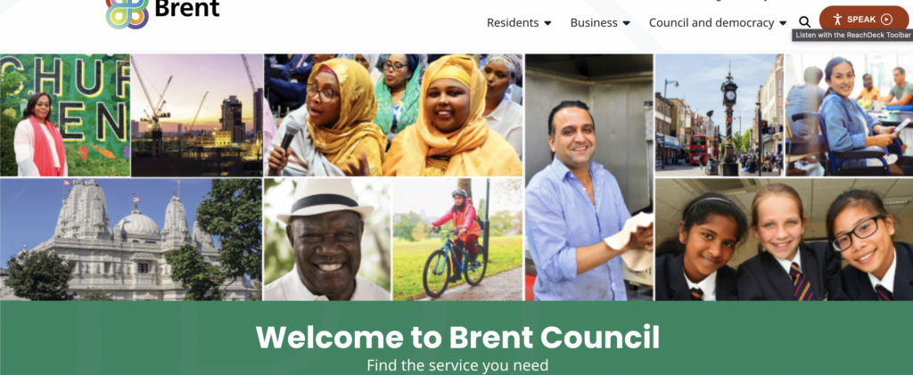
About: Brent Council is a website for residents looking to perform various online tasks and find local information. It was redesigned in 2021/2.
The homepage
Brent Council’s website is relatively unadorned, with little in the way of decoration to it. It uses the additive primary colour green in background blocks. This gives a sense of feeling ‘official’. Its navbar is also very plain, and the navlinks’ dropdown options prevent the navbar from being too cluttered.
Not many options are given upon viewing the homepage; you are either a resident or a business, with an additional option to view the council’s structure. Should a resident navigate to the site in order to find local information, their pathway would be very clear.
A mosaic of local residents imparts the message that the focus is on Brent’s population itself.
Reachdeck toolbar a clear option at the top of the page
The 2011 Census found that around one in seven Brent residents (14%) had a long-term health problem or disability that limited their day-to day-activities. The inclusion of Reachdeck software clearly placed in the header assists accessibility, with options for text-to-speech and page reading.
Options for residents
Clicking the residents’ option in the navbar opens a list of subcategories that navigate to the relevant page.
Visual subcategories
According to the 2011 census, 37% of the Brent population used a main language other than English – the 2nd highest in England. Around 9% of adults in Brent have poor proficiency in spokenEnglish. The inclusion of an icon grid below the resident subcategories further helps residents determine which section to navigate to.
Further options lower in the residents’ section
Options for residents are further simplified if they scroll past the subcategories; they are presented with a four-part grid made up of keywords. This can help users who might feel overwhelmed or unsure of which section to navigate to, and also those with limited English ability.
News and activities are placed closer to the bottom of the page. Most who log on to the site will have an idea of the action they wish to accomplish, and so more casual browsing is not prioritised.
Summary: Users and any difficulties they might face when using the site are prioritised on the Brent website, with accessibility a clear focus. Pathways are made as clear and short as possible, while any aesthetic visuals on the page are limited to images of the residents themselves.
About: The landing page for the Moulin Rouge theatre in Paris, which offers dining, live shows, and various experience packages. There is also an online shop.
Homepage when first navigating to the site
Aesthetics play a large role in the website, evident from the animation that plays upon first navigating to the site. This cover screen is fully animated and takes up the entire browser window.
However, this screen can be removed by a prominently placed cancel button on the top right. Once the user is on the page, this animated cover does not repeat. If left alone, the animated cover recedes after a few seconds, revealing the homepage. This prevents aesthetics from encroaching on the functionality of the site.
The navbar
The navbar is minimal, with few options and a call to action button on the right. The call to action button has inverted colours to make it stand out from the navlinks. Interestingly, the logo/homelink is placed in the centre of the navbar, which is a change from the usual left-hand alignment seen on most websites. This may be a matter of aesthetics, in order to showcase the logo while ensuring it is prominently placed for easy navigation.
As the Moulin Rouge is a renowned tourist destination, language options are available via a dropdown menu above the main navbar. However, the site automatically loads in either French or English, depending on the user’s location.
Drop-down menus on the navlinks
Drop-down menus on the navlinks allow for subcategory selection while keeping the header uncluttered.
Booking options page
Booking options and offers are presented via a series of ‘cards’ that the user scrolls down to explore. Each ‘card’ takes up the majority of the browser window in order to fully present its contents. This may be more effective than say, a carousel, as users can quickly scroll up and down between the cards to compare them.
The accompanying images on each card are the only images upon the page. The eye is drawn to these areas and nowhere else.
Unique aspects of each offer are highlighted in red text. While it may be chalked up to being a sales tactic to draw customers in, highlighting key features of each offer helps the user compare the offers faster, perhaps while skim-reading.
Footer
As is often the case with footers, it is mostly stripped down, without the spectacle of the main part of the page. This serves to provide a more ‘official’ tone to more functional information, such as contacts and parking.
The footer also includes some hidden features, such as video links to performances that are not available in the main site. In this way, the user is ‘rewarded’ for scrolling this far.
The most prominent feature of the footer is the call to action section, where the newsletter subscription and social media buttons are the only sources of colour. Furthermore, information on hearing aid assistance is highlighted in bold.
Summary: The Moulin Rouge places a lot of emphasis on its visuals, as is to be expected due to the establishment’s reputation. However, these aesthetic touches are minimal and do not eclipse the content of the page. In the case of the offers page, accompanying visuals help guide the eye to key information for the user.
Finally, some food for thought:
“Good web design is a balance between aesthetics and ethics.”
– Elliot Jay Stocks
“…design seeks to negotiate the qualities of the content with the affordances* of the format to produce a cohesive whole greater than the sum of the parts.”
– Frank Chimero
“Indifference towards people and the reality in which they live is actually the one and only cardinal sin in design.”
– Dieter Rams
“Less is more.”
– Ludwig Mies van der Rohe
Good web design is user-centred. When we build web properties or create web content, we do it for the user, we do not do it for ourselves and we do not do it for our client.
“In a world where content creation is cheap and 90% of it is crap, we have a decision to make: do we want to be part of the 90% noise or the 10% signal of the web.”
– Brad Frost
And lastly:
Content over aesthetics – aim for a balance, but content is the key draw overall.
The hook’s head is thick and solid, making it easy to push through tighter yarn weaves. It is also rounded, making it difficult to snag on the yarn and damage it. Its curve is also relatively open, making it easy to ‘catch’ the yarn on the first try. Immediately after the hook’s head, the ‘neck’ is quite narrow, meaning that that the user can avoid stretching out the yarnwork if necessary by not pushing the hook through too far.
The hook itself is separate from the handle, which is thicker than the hook. Its thickness prevents the hook from slipping through the work by accident when put down. The soft, almost rubber quality of the plastic makes it comfortable to hold for long periods of time. Its matte texture also makes it non-slip, and can be gripped well while working on projects.
The measurement of the hook is also printed on the handle towards the base, where the user is less likely to grip it and therefore rub it off over time. The colour of the handle is also vibrant, making it easy to spot if lost, perhaps under a skein of yarn. The colour also makes the hook easy to identify if bought as part of a multicoloured set, with each colour identifying a different hook size.
What is it?
A bath shelf.
How is it an example of good design?
The shelf unit is extremely simple in its execution. It has no adhesive qualities whatsoever, which makes it very easy to reposition depending on where the bath’s occupant chooses to sit. Gravity and measurements alone are enough to keep it in place.
The choice of wood as the material as opposed to plastic or metals is aesthetically pleasing and creates an overall rustic feel, which might be preferred due to the relaxing connotations of a hot bath. Wood also softens somewhat when wet, which would help prevent damage to the bath itself if knocked out of position, as well as prevent scrapes on the surface.
To prevent the shelf from sliding too far left or right, the central portion of it is set lower than the narrow ‘arms’ of the unit. The unit’s width is also carefully measured to fit the width of varying bath sizes. The curved sections serve to minimise the chance of the unit knocking directly against the bath’s rim. The shelf surface is also enclosed, preventing items from falling into the water below. Its bottom is also slatted, allowing any excess water to drip back through into the bath.
What is it?
A sealing clip.
How is it an example of good design?
It is minimal and unadorned. Its very shape makes it clear what its purpose is, and using it requires very little intuition.
The material is a sturdy plastic, which helps prevent it from losing its shape and therefore its grip on any packaging. Its stiff nature also allows the fastener to audibly snap into place. his serves to reassure the user that their packaging will indeed remain closed. That said, the fact that the product is plastic does allow it a small amount of flexibility, which is important to prevent it from shattering or snapping if a lot of pressure is placed on it. It can therefore be used on thicker or bunched up packaging if needed.
The grooves that run along the back of the fastener prevent it from slipping from the user’s grasp, which is particularly important as the user in most cases would only be using one hand, as the other would most likely be gripping the product they wish to seal.
The clips come in a variety of lengths, and each one is colour-coded. This makes it easy to know which clip to grab if there is a collection of them, perhaps in a disorganised drawer.
The clip is also inexpensive, which is essential as its relatively small size means that it is likely to become lost in a busy kitchen.