Categories
Content Management

Article – CSS Animations

What is CSS animation?

CSS animations are a way to add movement and interactivity to web pages using only CSS code, without the need for JavaScript or other programming languages. With CSS animations, we can create dynamic effects such as moving text and images, colour and font changes, and plenty of other visual touches.

CSS is a powerful tool that is often capable of more than we can imagine. Andy Clarke’s take on the AMC show Mad Men‘s opening credits is a testament to what CSS can accomplish:

Why use CSS animation?

There are several reasons why you might want to use CSS animations in your web design:

  1. Eye-catching visuals: CSS animations can make your website more visually appealing and engaging for users. Animations can help to draw attention to important elements on the page, and create a sense of interactivity that can make the user experience more enjoyable.
  2. Improved user experience: Animations can also be used to improve the user experience by providing visual feedback when a user interacts with a particular element on the page. For example, when a user hovers over a button, the button might change colour or move slightly, giving the user a sense of feedback that their action has been registered.
  3. Cross-browser compatibility: CSS animations are supported by all modern browsers. Older browsers can be accounted for with vendor prefixes, which we will cover later on.
  4. Performance: Because CSS animations are native to the browser, they tend to be faster and more efficient than animations created using JavaScript. This can help to improve the performance of your website and ensure that it loads quickly for users. Also, why use the most fragile layer to create animations when we can make them using CSS, the more robust layer?

How to use CSS animation

Before we jump into some animations, let’s take a look at what CSS technologies are available to us and how they work.

The transform property is an extremely useful tool that allows us to move, resize, rotate, and skew HTML elements on the page. It should be noted that while transforms change how the element is displayed, it is does not create ‘movement’ or animation when used by itself. The trick is to combine the transform property with a transition or keyframe animation.

The following functions can be performed with transform:

translate: Relocates the element on the page. This can be done on the horizontal axis with transform: translateX(), the vertical axis with transform: translateY(), or both the X and Y axis with translate().

scale: Makes an element appear larger or smaller. You can provide a ratio with scale, such as transform: scale(1.5). This would make the element 150% larger than its original size.

skew: Changes the angle of the element’s axis by a specified number of degrees, stretching it out accordingly. In other words, it makes the element ‘slanty’. You can do this on the horizontal axis with scaleX(), vertically with scaleY(), or both with scale().

rotate: Tilts the element’s angle clockwise with a positive degree value, or anti-clockwise with a negative degree value. For example, to rotate an element by 45 degrees, you would write transform: rotate(45deg).

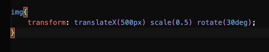
Here’s a quick look at how we can apply multiple transforms to manipulate an image of a cloud:

If we wanted to move the cloud to the right, make it smaller, and rotate it slightly, we could write:

The result is a cloud that has been moved 500px to the right, scaled to half its size, and rotated to a 30 degree clockwise angle.

Transitions in CSS are an integral part of animation and are often used in conjunction with the transform property to create smooth and fluid transitions between different states of an element.

Transitions allow you to specify how an element’s property should change over time, and is activated when a user interacts with the element, such as hovering over it or clicking on it. Transitions enable us to control the speed and timing of the change, creating a smooth sense of motion.

The syntax for transitions consists of:

transition: [transition-property] [transition-duration] [transition-timing-function] [transition-delay];

To break it down:

  • [transition-property] – selects the element property you wish to change
  • [transition-duration] – the duration of the change in seconds
  • [transition-timing-function] – how the transition is executed over time
  • [transition-delay] – an optional delay can be placed on the transition

Here’s an example of a transition applied to an element’s background colour that changes over a 0.3 second period:

transition-property: background-color;

transition-duration: 0.3s;

transition-timing-function: ease-in-out;

That’s all a bit wordy, but we can use shorthand to make our lives much easier:

transition: background-color 0.3s ease-in-out;

Many CSS properties are animatable with transitions. Here’s a handy list of some of them as seen in Jennifer Niederst Robbins’ book Learning Web Design:

However, if we just want a quick, one-size-fits-all for all of our state changes on an element without targeting things like the background colour or width individually, we can use the rather nifty all value for transition-property. This targets all of the changes you make to the element.

transition: all 0.3s ease-in-out;

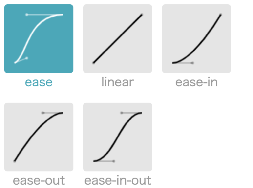
A closer look at the transition-timing-function

The transition-timing-function dictates how the transition speeds up or slows down while it is being carried out. For example, the transition might begin slowly, then pick up the pace through to the end (otherwise known as ease-in). You might prefer it to ease slowly into the transition, speed up in the middle, then slow down towards the end (ease-in-out).

The transition pace can be imagined as following a curve, where it flattens as the pace slows, and inclines as it speeds up. This is known as the cubic bezier.

An example of a simple transition

In this little animation of a car driving along a road, perhaps we want to move that cloud slowly to the left when we hover over it, just to give an impression of some extra movement. We would need to perform a transform on it that translates it on its x axis.

Don’t worry about all those strange -webkit prefixes just yet. We’ll get to them.

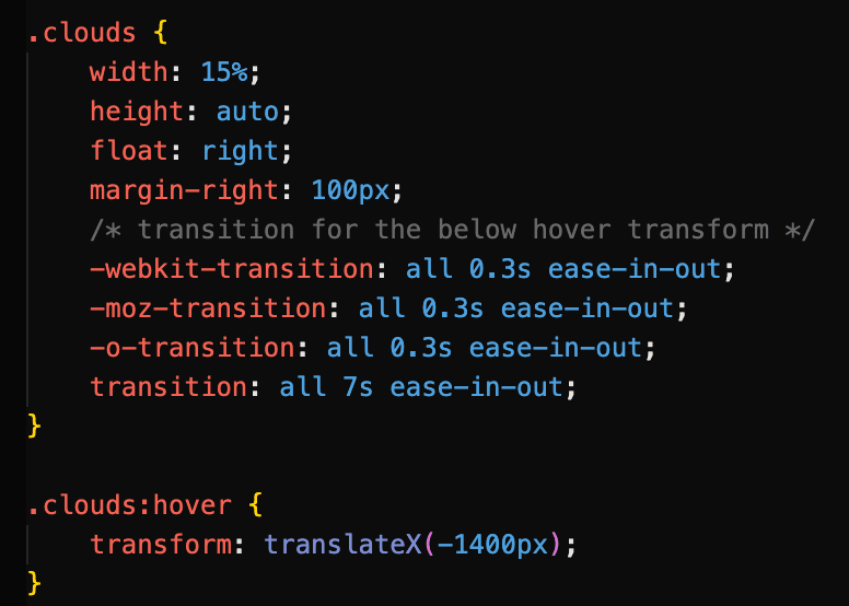
Here we use the transition property to specify that the cloud should move horizontally by 1400px over a duration of 7 seconds. Using ease-in-out, the cloud starts off slowly when we hover over it, builds momentum as it moves to the left, then slows down towards the end of the transition. Note that the transition is applied to the cloud image itself, while the transform property belongs with the triggering event (in this case, .clouds:hover).

View this animation here.

Browser support for transitions

Luckily, CSS transitions are supported by most modern web browsers. That said, the level of support may vary depending on the version of the browser, and some older browsers may not support certain CSS animation features. As a general rule, we should not expect to encounter any issues with browser versions released after 2013. To check which browsers support transitions, you can refer to online resources such as CanIUse.com, which gives comprehensive information on the support for various CSS features across different web browsers, including version numbers and any known issues or limitations.

You might have spotted some vendor prefixes in our hovering cloud example code above. Just on the off-chance that someone views your site in an older browser, you can use vendor prefixes in your transitions to ensure that they will run. We can also let someone else do the hard work for us by heading to autoprefixer.github.io, which parses our CSS and generates the vendor prefixes we need to include in our code.

Autoprefixer can do all the heavy lifting for us.

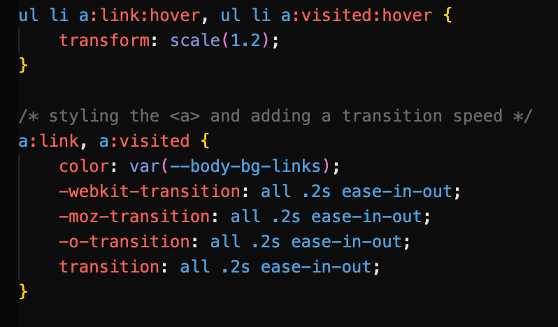
Here’s an example of a transition that uses vendor prefixes to support older browsers. Each link icon has a transform: scale() on hover applied to it with a transition:

These prefixes cover older versions of Safari, Firefox, and Opera respectively. Note that the ‘plain’ transition goes last in the cascade.

Keyframes can be considered animation ‘proper’; they do not need to rely on a user interaction to execute, and can run a certain number of times or even infinitely if desired. Keyframes can dictate exactly how an element’s state changes, and you can explicitly express not just the beginning and end points of the animation, but any part of it in between. Keyframes can be used in conjunction with transforms to produce a variety of effects.

Once the keyframes have been defined, the animation property that references the keyframes can be applied directly to the element you would like to animate. It is easiest to think of the keyframes as an animation ‘script’ that can then be referenced where it is needed.

The syntax for keyframe animations is made up of two parts:

Part 1: Defining the keyframes

@keyframes name-of-animation {

0% { opacity: 0; }

20% { opacity: 1; }

80% { opacity: 0; }

100% { opacity: 1; }

}

After naming our animation, we can define exactly what happens in the animation using percentages, with 0% denoting the start of the animation and 100% signifying the end. In this case, the element’s opacity will change in intervals.

We are not limited to percentages, however, and can simply use the from and to keywords to define the start and end of the animation, as we see in this animation named whoosh that uses transform: translate() to move an element to the left.

@keyframes whoosh {

from {transform: translateX(0) }

to {transform: translateX(-400) } }

Part 2: Calling the animation

.animate-this-element {

animation: name-of-animation 5s infinite;

}

The animation property is then used on the target element to call the defined keyframes and change the state of the element as desired. Above, shorthand has been used to reference the animation name, the animation’s duration, and the number of times the animation will run. In full, the animation properties include:

For efficiency, it is a good idea to use shorthand animation properties. They should also look rather familiar, as they are very similar to transition properties.

  • animation-name (required) – the name of the animation as specified in the keyframes
  • animation-duration(required) – usually given in seconds
  • animation-timing-function – options include ease, ease-in, linear, and all the timing-function values we have already encountered with transitions
  • animation-iteration-count – how many times the animation should repeat. This can be a number or set to infinite
  • animation-direction – this defines whether the animation plays forward (normal), backwards (reverse), or back and forth (alternate). You can also start the animation from the end with alternate-reverse.

A simple example of a keyframe animation

Let’s drive our car from earlier on.

We begin by defining our keyframes. The car is a PNG image that will move from the left to the right of the page by 1500px. We can use from and to to do this:

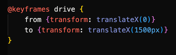
The animation is then called on the car element.

The animation will last for 5 seconds and run infinitely on a loop.

Combining multiple transform properties with keyframe animations

We can combine transforms to create more complex and dynamic effects. In the example below, a sense of movement and perspective is gained in our desert highway scene by combining scale and translate on elements. As they approach the ‘camera’ and get closer, their sizes increase.

The white road marking is moved to the bottom of the page with translateY, and it is scaled up over time. This gives the impression of driving from a first-person perspective.

When we call the animation on our .lines element, we set it to run at a steady pace for 2 seconds with linear on an infinite loop.

Combining multiple transforms can produce a variety of effects.

View this animation page here.

Working with SVG

SVG elements (Scalable Vector Graphics) are an increasingly popular choice for adding movement to web pages, and can be used with CSS to make simple animations. They can also be animated with the XML language SMIL as well as JavaScript to create more complex animations. However, it would be wise to use SVG sparingly when animating due to poor browser support. Indeed, it is a good idea to consider fallback techniques.

CSS fallback for SVG

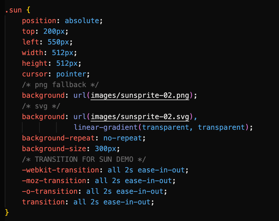
In our desert scene animation, the sun is a SVG sprite that changes colour when clicked and hovered upon, using a flipbook-like mechanic where three sun images are combined. However, if the user’s web browser does not support SVG, the animation will not work.

The sprite changes position as the user interacts with it.

As a fallback, we have set a PNG of the sprite image just before the SVG version in the cascade. This way, the sun will still appear and work as expected, even if an older browser is being used.

More on CSS Animation Fallbacks

There are several types of CSS fallbacks that can be used for animations to ensure that the animation is still presentable and works as expected, even if the user’s browser doesn’t support the animation effect.

Here are some common types of CSS fallbacks used for animations:

  • Static fallbacks: These are simple styles that are applied to the element if the animation is not supported. For example, if you have a CSS animation that rotates an element, you might apply a transform: none property to the element as a static fallback so that it still looks good and is positioned correctly even if the rotation effect is not supported.
  • Feature detection: One way to provide a fallback is to use feature detection to determine whether a particular CSS animation effect is supported by the user’s browser. If it is not, you can use a different animation effect or a static fallback instead. This approach requires some additional coding, but can help ensure that your website works as expected for all users.
  • Progressive enhancement: Another approach is to use progressive enhancement, where you start with a simple, static design that works for all users, and then add more complex animation effects using CSS and JavaScript for users with newer browsers that support these features.

By using these types of fallbacks, you can ensure that your animations still look presentable and work as expected, even if some users are not able to see the full animation effect. This can help improve the accessibility and usability of your website for a wider range of users.

Things to bear in mind when animating

It’s important to remember that by providing fallbacks, you can ensure that your website is still usable and accessible for all users, regardless of their browser or device.

Next, we may choose to (and probably should) make use of the prefers-reduced-motion media query in our CSS to detect whether users have opted for reduced animation in their accessibility preferences. Many users suffer from motion disorders and other sensory conditions, and we need to account for them in our design.

We should also consider how animation should be used, and how much is too much. After all, while a bit of polish and flair goes a long way, we do not want our website to become a 2002 Geocities page full of flashy graphics and whirling GIFs.

When used with consideration, animations can greatly enhance the user experience and bring some added delight to our web pages.

References

  1. Seminar slides – https://zaraknox.co.uk/coursework/content-management/slides.pdf
  2. Chapter 18 of Learning Web Design by Jennifer Niederst Robbins: Transitions, Transforms, and Animation, 5th Edition 2018
  3. CSS animations – https://developer.mozilla.org/en-US/docs/Web/CSS/animation
  4. CSS animations – https://css-tricks.com/almanac/properties/a/animation/
  5. Transform, transition, keyframes and animation – https://www.youtube.com/watch?v=jgw82b5Y2MU&list=PL4cUxeGkcC9iGYgmEd2dm3zAKzyCGDtM5
  6. SVG Fallbacks – https://css-tricks.com/a-complete-guide-to-svg-fallbacks/

Categories
Crit Major Project Task

Crit 2: Commodity

Target group: who exactly is your website for?

My site will be aimed at people looking to start a new craft and looking for guidance on the subject of resin. Furthermore, the site may serve as an inspiration guide for those who are not necessarily new to the craft, but looking for ideas for new projects.

During the research for my Business and Cultural Context Crit, I discovered that the majority of crafters are women aged between 35-44, although this age range is gradually decreasing. I therefore believe the main target audience for my website to be older millennial women looking to find new creative pursuits. However, the website will aim to be as inclusive as possible, and should still be equally functional to anyone interested in learning more about resin-craft.

User persona: what kind of person are you planning this site for?

When embarking on my research for the User Experience Design module, I decided to reach out to resin crafters directly in order to build more of an understanding of who they were. For this I opted to conduct a Q&A on the Resin subreddit, where I asked the group what drew them to the craft, as well as what might frustrate them about the medium. However, I noticed that the community was not particularly active, with an average of 0-3 replies on each post. I was therefore not sure if I would receive many replies. However, in a 24-hour period I received over 15 replies to my initial question. Some of these answers were deeply personal when giving their reasons for starting to make resin, and the reasons differed greatly. I noted that recurring reasons included:

  • a need for a creative outlet
  • dealing with grief
  • alleviating stress

Furthermore, many of the replies seem to reflect my projected demographic; for example, many appeared to come from women. The pain points they listed for resin-craft include:

  • safety risks
  • price of materials
  • identifying the best tools for use
  • mess/space

As Youtube was cited as a common resource in my Reddit Q&A, I decided to pursue further research both in order to flesh out my user profiles further and also help refine what my content should include. I gathered user comments from resin-craft Youtube tutorials, being sure to include videos aimed at both complete beginners and more advanced crafters. The comments mainly consist of feedback on the video content, as well as troubleshooting issues with users’ own projects. From their feedback, it became clear that users:

  • preferred content that was to the point with no ‘babble’
  • wanted clear information on where to source crafting materials
  • preferred voice direction over distracting background music
  • wanted clear, step-by-step instructions

It was at this point I felt I could create user personas based on the Redditors I had interacted with. These user profiles are amalgamations of the responses I received from the Reddit community, with similar circumstances and motivations. They also share the same pain points as both the Reddit and Youtube communities. Furthermore, just as the Reddit community does, these user personas use a variety of influences in locating information on resin-craft, such as social media, online search engines, or directly from peers. They can be summarised as below:

Group A/Beth: A 28-year-old busy professional looking for a creative outlet. Pain points include time-consumption and difficulty level

Group B/Caroline: A recently bereaved 36-year-old looking for inspiration for crafting time with her partner. Pain points include cost and locating of materials

Group C/Sam: a 41-year-old stay-at-home mother eager to start a craft business from home. Pain points include time consumption, level of focus required

Group D/Deborah: a 48-year-old gardener recovering from illness who would like to make use of leftover flowers. Pain points include concerns about safety, clarity of instruction

User journeys: how will your site fit into real life scenarios?

At this point it is worth considering how my users would be most likely to access my site. More than one Reddit response stated that they looked for tutorials on Youtube when they started learning the craft. It would therefore make sense to create a Youtube channel for users to browse as a first point of call that would then link to my site for additional information and resources. The type of device used to access the site is also worth considering. For example, one of my personas is looking to start a business while juggling duties at home. They may not have time to sit down at a desktop computer to do their research, and therefore might choose to access the site via mobile or tablet.

Depending on each user, the user journey might look a little different. When plotting out user journeys, I bore my user personas, as well as their influences, user stories, and job stories in mind:

Group A/Beth: views resin-craft content on Instagram → follows tutorials on Youtube → navigates to my website from there → checks the length of the tutorials in the tutorial section to see if they are long

Group B/Caroline: views my tutorials on Youtube → active on Reddit community → locates site and navigates to the tutorials to see if materials are listed/easily sourced and affordable, as well as if there are plenty of creative ideas

Group C/Sam: has been trying to follow online courses online but finds they require a lot of time and deep focus → searches for alternatives → finds my site and navigates to tutorials to see if instructions are clear/have audio directions

Group D/Deborah: hears about resin-craft through friends → watches some Youtube tutorials → searches online for more information → finds my site and navigates to safety section for guidance

Content strategy: what kind of content will support the site’s mission and benefit its users?

From the above scenarios, it is clear that due to my users’ concerns over time-constraints, budget, difficulty levels, safety, and need for inspiration, my site must include:

  • video tutorials with audio for those who might become distracted
  • concise videos with no ‘filler’ content/’babbling’
  • clear instructions
  • a section on safety that is easy to find
  • clear information on where materials can be sourced
  • cost of materials for budgeters

The information architecture must also be simple and easy to navigate. It would be beneficial to use a stripped-back, minimal approach to the design to help facilitate this, with tutorials, setup tips and safety precautions all easily accessible from the home screen. Including quick links in the footer may also be beneficial to prevent unnecessary scrolling.

As progress on my website continues to evolve, it would be in my interests to refer back to this Commodity Crit to ensure I am fulfilling the user’s needs, as well as solving their problems.

Categories
Design for Web Content Task

Three Websites with Good Colour Schemes

SVZ

This design studio uses black backgrounds with a muted peach shade for its text. This understated look contrasts the brightly coloured animated shapes that gently float across the screen.

These moving shapes recur throughout the website. Their neon shades and random shaping are for the most part not recognisable as any familiar objects. This very much gives the impression that we are looking at a work of design, where thought has been put into every shape, quite possibly beyond the scope of the viewer’s understanding. All we know is that we are looking at the work of designers, with meaning that might elude us due to their seeming complexity.

For call to action sections, such as the contact page, bright colours are taken away and replaced with a more conventional photo of a team member.

Molly Dooker Wines

This wine producer eschews the understated look of most product pages, and instead is an explosion of layered colours and images.

A warm shade of yellow is reminiscent of sunlight and hazy weather, while the verdant greens remind the user that nature is a central theme of the business.

Black and white Python-esque imagery contrasts with the warm shades of the backgrounds, as well as the tropical, exotic imagery.

When buying online, shoppers have become accustomed to minimalist layouts, few colours, and linear product listings. With highly stylised fonts, as well as slightly psychedelic warm tones and patterns, this site by all means should not ‘work’. Yet it does.

The Pioneer Woman

Ree Drummond’s carefully crafted image as a country gal is reflected in her site’s choice of colours. The slightly twee pinks, reds, and blues of the flowers in the header are reminiscent of a country living room, as is the muted green that resembles slightly faded wallpaper.

The background textured yellow would also not look out of place in a Southern drawing room (or kitchen, given that this is predominantly a recipe site). Yellow, as well as being a bright, friendly colour, is often used in fast food logos. According to Stellen Design, yellow is a colour often intended to evoke hunger, as is red. The Pioneer Woman site uses this yellow throughout, as well as the red lettering of the logo and nav links.

In the fashion section, we see a light teal shade that contrasts with red and light coloured flowers, again reminiscent of wallpaper. The colours in this context are feminine and cheery, and while blue is often labelled a cold colour, here it is warm and inviting.

Categories
Design for Web Content Task

Design for Web Content – Three Examples of Beautiful Typography in Websites

TOURISTS (Desktop view)

This Massachusetts hotel uses two main fonts throughout. Its header, subheadings and nav links are a bold sans-serif that immediately draws the eye. Note that its call to action (‘Book Now’) is the only colouring.

The heading font is warm, with somewhat rounded edges and a use of caps that seem reminiscent of the Tintin book series. This gives a sense of adventure, and with its almost khaki background colour, seems to harken to a time of colonial exploration, safaris, and travels of yesteryear.

The site chooses to use a monospace font for its secondary typeface. This is a somewhat bold move, as its fine, small lettering threatens to be easily ignored. However, it serves to contrast with the bold headers, and is not eclipsed by them. It seems like text suited to a mission brief, hastily typed out on a typewriter. This works well with the site’s vintage aesthetic, and a sense of adventure in unknown lands.

The New Yorker (Desktop view)

Established in 1925, The New Yorker has not strayed far from its origins in terms of type. It uses characteristic headers with extremely wide counters, giving a rounded appearance to the characters. Serifs are ornate but understated. Overall, there is an art deco, Roaring Twenties feel to the headings.

When an article is opened, there is a lot of whitespace surrounding the headline. This makes it very clear to the reader which article they are currently reading.

The New Yorker makes the decision to use all uppercase on its headlines, dates, and its logo. While this may create difficulty for some readers due to all of the characters appearing on the same level, the use of white space around these areas helps to prevent cluttering and confusion.

A much more ‘web-friendly’ bold sans-serif is used for the author’s name and date, while the byline is in italics. The different weights and styling help the reader to distinguish these pieces of information from each other.

Interestingly, The New Yorker chooses to use serifs for its article text, as well as drop caps for its opening line. In this way, the text closely mimics that of a printed article. Line height also prevents the text from becoming too blocky and difficult to read on phones, tablets, and desktops. This imitation of the printed word gives the reader the sense that they are indeed reading a magazine, and that they are not losing the pleasurable aesthetics of print simply because they have opted to use a screen.

9 Hours (Mobile view)

9 Hours is a Japanese capsule hotel, and its website has been fully translated into English from the original Japanese.

With the exception of the logo, where the words ‘nine hours’ are slightly less weighty than the ‘9h’ in bold, this page chooses to use the same bold typeface throughout the site.

This minimalist approach to type is symbolic of the hotel itself, which makes much of “stripping away the unnecessary.” The site’s use of pictographs and icons in conjunction with text further gives the reader the feel that text has been chosen carefully.

Subheadings are bolder than body text to differentiate between the amenities. Key information such as check-in times have slightly wider character spacing/kerning than the rest of the body text to set it apart and draw attention to it.

Sections of information are arranged into small blocks or pods, almost as if they too are capsules themselves.

Categories
Design for Web Content Task

Design for Web Content – Good Design II

THREE WEBSITES THAT DISPLAY GOOD DESIGN

  1. Etsy

About: Etsy is an online marketplace where users themselves are the merchants. The content is ever-changing, and users are encouraged to review any purchases they make.

The homepage

Upon entering the homepage, the eye is drawn to the large searchbar at the top of the screen.

The logo is also relatively understated, while the pastel colour theme of the banner is minimal and muted. Aesthetics are not the main focus.

Sub categories at the top are clearly laid out.

The layout makes the user journey clear; most users will have a specific idea of the sort of products they are looking for and either head for the subcategories or the searchbar. Options for browsing more casually are located further down the page, and less of a priority.

Once a search term has been entered

Search results are displayed in a clear grid, with images of the products taking up the most real estate. Only the key information (the information the user is most interested in) is in bold – the rating of the seller and the price. Even the name of each product is not what the eye is drawn to.

The subscribe button

The invitation to subscribe to a mailing list is almost at the bottom of the page. Only those specifically looking for it are likely to see it, and its presence is unobtrusive. There are no pop-ups.

The footer

Hierarchy plays a role in the layout, with information less relevant to the user displayed in the footer.

The bottom of the page, where more ‘corporate’ information can be found, has a completely different aesthetic to the higher parts of the page. It is a solid, official blue and very unadorned. It creates a sense of being more business-like. Users looking at this section are more likely to be jobseekers, businesses, or those seeking to make a complaint or report. The overall tone is one of professionalism, which creates a sense of trust.

If the main part of the page is the shop front, then the footer is the back office.

Summary: It is easy for users to look for specific items and quickly assess the information they need. Aesthetics play a smaller role, and mainly the content (products) itself make up the visuals on the page. Etsy’s corporate presence is minimised on the page in favour of user content.

2. Brent Council

About: Brent Council is a website for residents looking to perform various online tasks and find local information. It was redesigned in 2021/2.

The homepage

Brent Council’s website is relatively unadorned, with little in the way of decoration to it. It uses the additive primary colour green in background blocks. This gives a sense of feeling ‘official’. Its navbar is also very plain, and the navlinks’ dropdown options prevent the navbar from being too cluttered.

Not many options are given upon viewing the homepage; you are either a resident or a business, with an additional option to view the council’s structure. Should a resident navigate to the site in order to find local information, their pathway would be very clear.

A mosaic of local residents imparts the message that the focus is on Brent’s population itself.

Reachdeck toolbar a clear option at the top of the page

The 2011 Census found that around one in seven Brent residents (14%) had a long-term health problem or disability that limited their day-to day-activities. The inclusion of Reachdeck software clearly placed in the header assists accessibility, with options for text-to-speech and page reading.

Options for residents

Clicking the residents’ option in the navbar opens a list of subcategories that navigate to the relevant page.

Visual subcategories

According to the 2011 census, 37% of the Brent population used a main language other than English – the 2nd highest in England. Around 9% of adults in Brent have poor proficiency in spoken English. The inclusion of an icon grid below the resident subcategories further helps residents determine which section to navigate to.

Further options lower in the residents’ section

Options for residents are further simplified if they scroll past the subcategories; they are presented with a four-part grid made up of keywords. This can help users who might feel overwhelmed or unsure of which section to navigate to, and also those with limited English ability.

News and activities are placed closer to the bottom of the page. Most who log on to the site will have an idea of the action they wish to accomplish, and so more casual browsing is not prioritised.

Summary: Users and any difficulties they might face when using the site are prioritised on the Brent website, with accessibility a clear focus. Pathways are made as clear and short as possible, while any aesthetic visuals on the page are limited to images of the residents themselves.

More on council websites here.

3. Moulin Rouge

About: The landing page for the Moulin Rouge theatre in Paris, which offers dining, live shows, and various experience packages. There is also an online shop.

Homepage when first navigating to the site

Aesthetics play a large role in the website, evident from the animation that plays upon first navigating to the site. This cover screen is fully animated and takes up the entire browser window.

However, this screen can be removed by a prominently placed cancel button on the top right. Once the user is on the page, this animated cover does not repeat. If left alone, the animated cover recedes after a few seconds, revealing the homepage. This prevents aesthetics from encroaching on the functionality of the site.

The navbar

The navbar is minimal, with few options and a call to action button on the right. The call to action button has inverted colours to make it stand out from the navlinks. Interestingly, the logo/homelink is placed in the centre of the navbar, which is a change from the usual left-hand alignment seen on most websites. This may be a matter of aesthetics, in order to showcase the logo while ensuring it is prominently placed for easy navigation.

As the Moulin Rouge is a renowned tourist destination, language options are available via a dropdown menu above the main navbar. However, the site automatically loads in either French or English, depending on the user’s location.

Drop-down menus on the navlinks

Drop-down menus on the navlinks allow for subcategory selection while keeping the header uncluttered.

Booking options page

Booking options and offers are presented via a series of ‘cards’ that the user scrolls down to explore. Each ‘card’ takes up the majority of the browser window in order to fully present its contents. This may be more effective than say, a carousel, as users can quickly scroll up and down between the cards to compare them.

The accompanying images on each card are the only images upon the page. The eye is drawn to these areas and nowhere else.

Unique aspects of each offer are highlighted in red text. While it may be chalked up to being a sales tactic to draw customers in, highlighting key features of each offer helps the user compare the offers faster, perhaps while skim-reading.

Footer

As is often the case with footers, it is mostly stripped down, without the spectacle of the main part of the page. This serves to provide a more ‘official’ tone to more functional information, such as contacts and parking.

The footer also includes some hidden features, such as video links to performances that are not available in the main site. In this way, the user is ‘rewarded’ for scrolling this far.

The most prominent feature of the footer is the call to action section, where the newsletter subscription and social media buttons are the only sources of colour. Furthermore, information on hearing aid assistance is highlighted in bold.

Summary: The Moulin Rouge places a lot of emphasis on its visuals, as is to be expected due to the establishment’s reputation. However, these aesthetic touches are minimal and do not eclipse the content of the page. In the case of the offers page, accompanying visuals help guide the eye to key information for the user.

Finally, some food for thought:

“Good web design is a balance between aesthetics and ethics.”

– Elliot Jay Stocks

“…design seeks to negotiate the qualities of the content with the affordances* of the format to produce a cohesive whole greater than the sum of the parts.”

– Frank Chimero

“Indifference towards people and the reality in which they live is actually
the one and only cardinal sin in design.”

– Dieter Rams

“Less is more.”

– Ludwig Mies van der Rohe

Good web design is user-centred. When we build web properties or create web
content, we do it for the user, we do not do it for ourselves and we do not do it for our client.

“In a world where content creation is cheap and 90% of it is crap, we have a
decision to make: do we want to be part of the 90% noise or the 10% signal of the web.”

– Brad Frost

And lastly:

Content over aesthetics – aim for a balance, but content is the key draw overall.

Categories
Design for Web Content Task

Design for Web Content – Good Design I

THREE OBJECTS THAT DISPLAY GOOD DESIGN

What is it?

A crochet hook.

How is it an example of good design?

The hook’s head is thick and solid, making it easy to push through tighter yarn weaves. It is also rounded, making it difficult to snag on the yarn and damage it. Its curve is also relatively open, making it easy to ‘catch’ the yarn on the first try. Immediately after the hook’s head, the ‘neck’ is quite narrow, meaning that that the user can avoid stretching out the yarnwork if necessary by not pushing the hook through too far.

The hook itself is separate from the handle, which is thicker than the hook. Its thickness prevents the hook from slipping through the work by accident when put down. The soft, almost rubber quality of the plastic makes it comfortable to hold for long periods of time. Its matte texture also makes it non-slip, and can be gripped well while working on projects.

The measurement of the hook is also printed on the handle towards the base, where the user is less likely to grip it and therefore rub it off over time. The colour of the handle is also vibrant, making it easy to spot if lost, perhaps under a skein of yarn. The colour also makes the hook easy to identify if bought as part of a multicoloured set, with each colour identifying a different hook size.

What is it?

A bath shelf.

How is it an example of good design?

The shelf unit is extremely simple in its execution. It has no adhesive qualities whatsoever, which makes it very easy to reposition depending on where the bath’s occupant chooses to sit. Gravity and measurements alone are enough to keep it in place.

The choice of wood as the material as opposed to plastic or metals is aesthetically pleasing and creates an overall rustic feel, which might be preferred due to the relaxing connotations of a hot bath. Wood also softens somewhat when wet, which would help prevent damage to the bath itself if knocked out of position, as well as prevent scrapes on the surface.

To prevent the shelf from sliding too far left or right, the central portion of it is set lower than the narrow ‘arms’ of the unit. The unit’s width is also carefully measured to fit the width of varying bath sizes. The curved sections serve to minimise the chance of the unit knocking directly against the bath’s rim. The shelf surface is also enclosed, preventing items from falling into the water below. Its bottom is also slatted, allowing any excess water to drip back through into the bath.

What is it?

A sealing clip.

How is it an example of good design?

It is minimal and unadorned. Its very shape makes it clear what its purpose is, and using it requires very little intuition.

The material is a sturdy plastic, which helps prevent it from losing its shape and therefore its grip on any packaging. Its stiff nature also allows the fastener to audibly snap into place. his serves to reassure the user that their packaging will indeed remain closed. That said, the fact that the product is plastic does allow it a small amount of flexibility, which is important to prevent it from shattering or snapping if a lot of pressure is placed on it. It can therefore be used on thicker or bunched up packaging if needed.

The grooves that run along the back of the fastener prevent it from slipping from the user’s grasp, which is particularly important as the user in most cases would only be using one hand, as the other would most likely be gripping the product they wish to seal.

The clips come in a variety of lengths, and each one is colour-coded. This makes it easy to know which clip to grab if there is a collection of them, perhaps in a disorganised drawer.

The clip is also inexpensive, which is essential as its relatively small size means that it is likely to become lost in a busy kitchen.